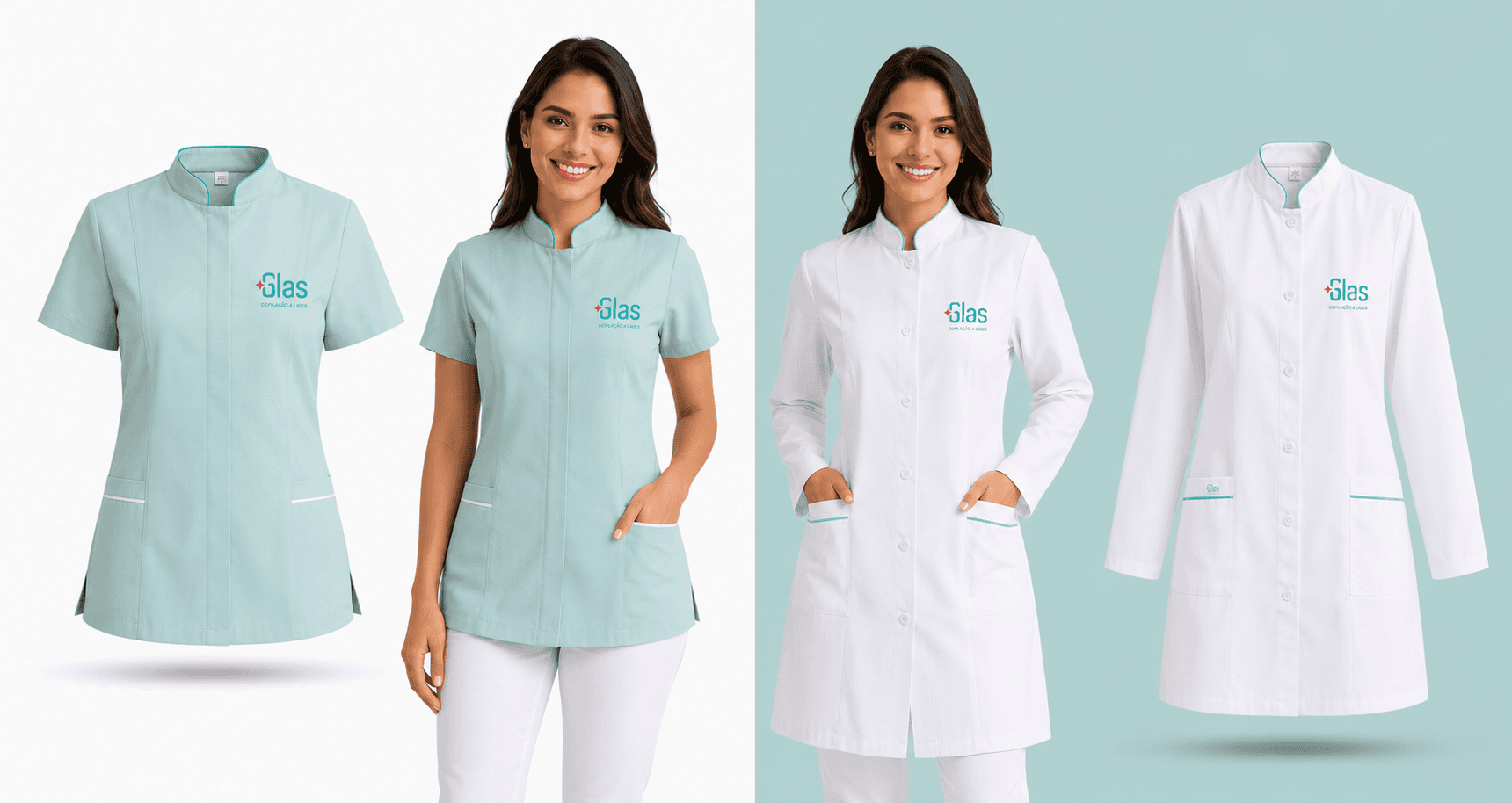
GlasLaser Brand Repositioning
New visual identity to reposition the brand and communicate an aesthetic experience based on technology, comfort, and trust.
Cliente
GlasLaser
Categorias
Redesign; Branding; Visual Identity
Ferramentas
Illustrator; Photoshop; InDesign
Ano
2020
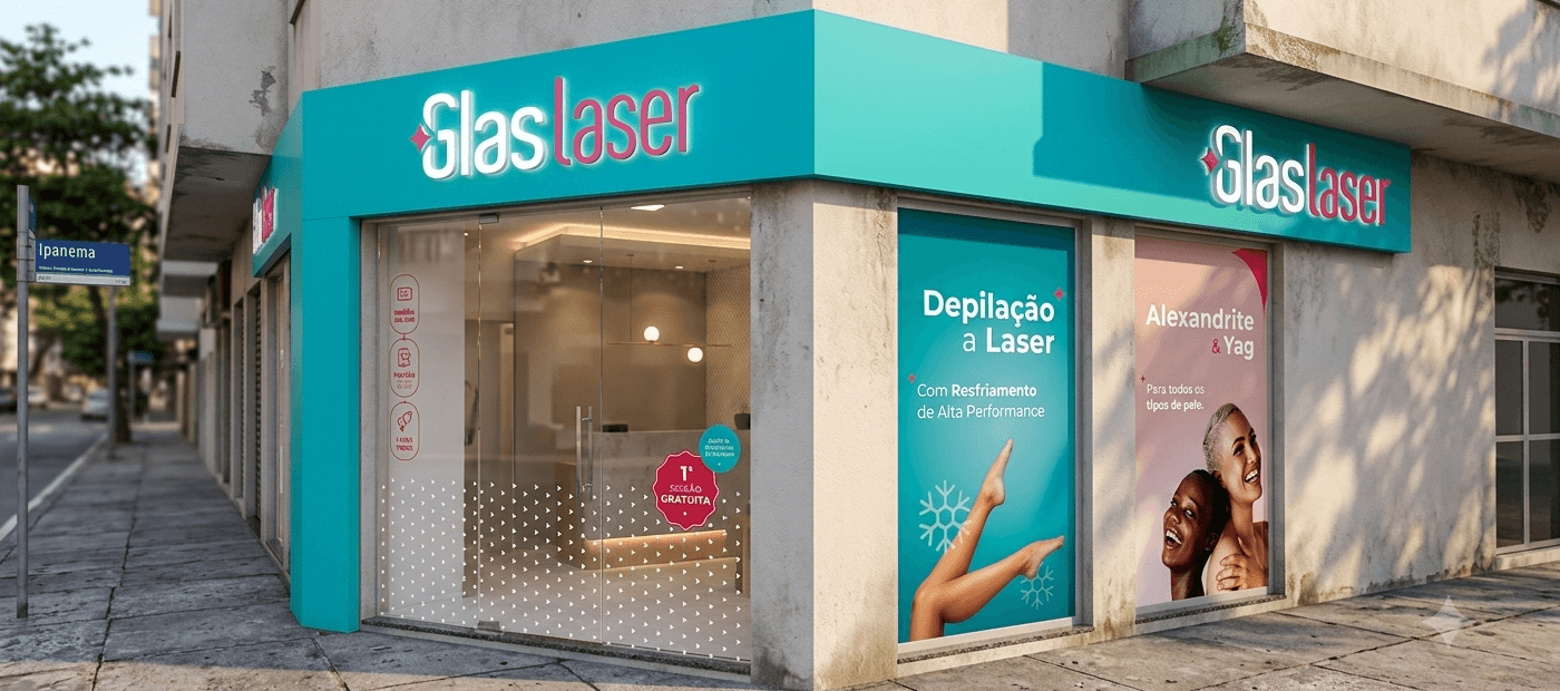
The identity needed to break with the perception of pain associated with laser treatments and reposition the brand as an experience of technology, care, and comfort.
Contexto
Glas is one of the pioneering companies in laser hair removal in Brazil and, for more than two decades, has been offering accessible, safe, and high-quality treatments. Although laser hair removal is its main service, its portfolio also includes various aesthetic and dermatological treatments, such as tattoo removal, melasma lightening, spider vein treatment, nail fungus treatment, and facial rejuvenation.
Throughout its trajectory, innovation has always been at the center of the business. The company continuously invests in cutting-edge technologies, using equipment such as Alexandrite and Nd:YAG lasers to offer more effective treatments suitable for different skin types. Furthermore, it developed its own high-performance cooling system, capable of numbing the skin moments before laser application, providing more comfort and significantly reducing pain during the procedure.
This commitment to technology became one of Glas's main competitive differentials — and also the starting point for building its new visual identity.
Previous Identity Assessment
Glas's visual identity was built at a time when laser hair removal represented virtually all of the business. With the expansion of the portfolio and the strengthening of the company as a reference in aesthetic and dermatological treatments with laser technology, the brand began to communicate a reality that no longer corresponded to the company's positioning.
The choice of red, although ensuring high visibility, evoked sensations such as heat, alert, and pain — associations hardly compatible with a brand whose main differential is precisely providing more comfortable treatment through proprietary skin-cooling technology.
The graphic symbol also directed attention to the problem, using hair as the central element of the identity. Rather than communicating the benefit of the treatment, the brand emphasized precisely what the customer wanted to eliminate.
Finally, the signature"Laser Hair Removal"restricted the brand's perception to its most well-known service, failing to represent the breadth of the portfolio. Moreover, its extremely condensed typography compromised readability in reduced applications, limiting the efficiency of the identity across different touchpoints.
More than updating its appearance, the identity needed to reflect what differentiated Glas in the market: an aesthetics company built on technological innovation, scientific precision, and patient comfort.

Glas's New Identity
The proposal for the new visual identity was to bring Glas closer to the world of technology without compromising an accessible and welcoming language. The goal was to build a brand that conveyed innovation, precision, and trust while preserving proximity with a broad audience.
The old identity placed the problem front and center. The redesign shifts this prominence to the solution: laser technology, the company's true competitive advantage.

The color palette was reorganized to communicate the business's main differentials. Red was preserved as a representation of the laser, maintaining some of the recognition built by the previous brand. In return, turquoise-green assumed prominence, symbolizing the high-performance cooling system — an exclusive technology that reduces pain and provides a more comfortable experience during treatment.
The graphic symbol was also reframed. Instead of highlighting the problem, it now represents the solution itself: the laser beam. This shift redirects communication focus to what truly differentiates the company, reinforcing its positioning as a reference in technological innovation.
Finally, the brand signature evolved from"Laser Hair Removal"to"Glas Laser", expanding its capacity to represent the entire portfolio of dermatological treatments performed with laser technology. The new architecture makes the identity more flexible, strengthens brand recognition, and aligns with its expansion beyond hair removal.