ASP Brand Repositioning
Visual identity redesign to communicate the company's expansion and strengthen its positioning in the environmental engineering sector.
Customer
ASP Engineering
Categories
Redesign; Branding
Tools
Illustrator; Figma; Photoshop
Year
2023

The new brand needed to reflect the company's evolution, preserving its credibility in the environmental sector while expanding into new services and markets.
Context
ASP Engenharia was undergoing a significant transformation. Beyond changes in its ownership structure, the company was expanding into new environmental engineering segments, including Hydrology. This strategic evolution revealed an opportunity to align the brand identity with the company's new positioning, visually communicating a broader portfolio and a future vision focused on growth, innovation, and sustainability.
Previous Identity Diagnosis
A identidade visual da ASP buscava representar suas áreas de atuação por meio das cores, associando cada uma delas a elementos como água, solo e vegetação. Apesar desse conceito, a marca acabou transmitindo uma imagem mais próxima do setor de tecnologia do que da engenharia ambiental, devido à linguagem de outline, que estava amplamente difundida e já saturada no mercado.
Além disso, o excesso de cores dificultava a identificação imediata do segmento da empresa, enquanto o símbolo carecia de força suficiente para funcionar de forma independente da assinatura tipográfica, limitando sua aplicação em diferentes contextos.
Com a reestruturação societária e a expansão do portfólio, surgiu a oportunidade de construir uma identidade visual mais consistente, capaz de traduzir a maturidade da empresa, fortalecer seu posicionamento e refletir seu papel no setor ambiental.

ASP's New Identity
The new visual identity emerged from the need to translate ASP's evolution. Beyond updating its appearance, the challenge was to build a brand that reflected business expansion, multidisciplinary expertise, and the maturity gained over the years.
The entire process was guided by five core concepts: Sustainability, Materiality, Transformation, Connection, and Expansion. These principles guided every project decision, from symbol construction to visual language definition.

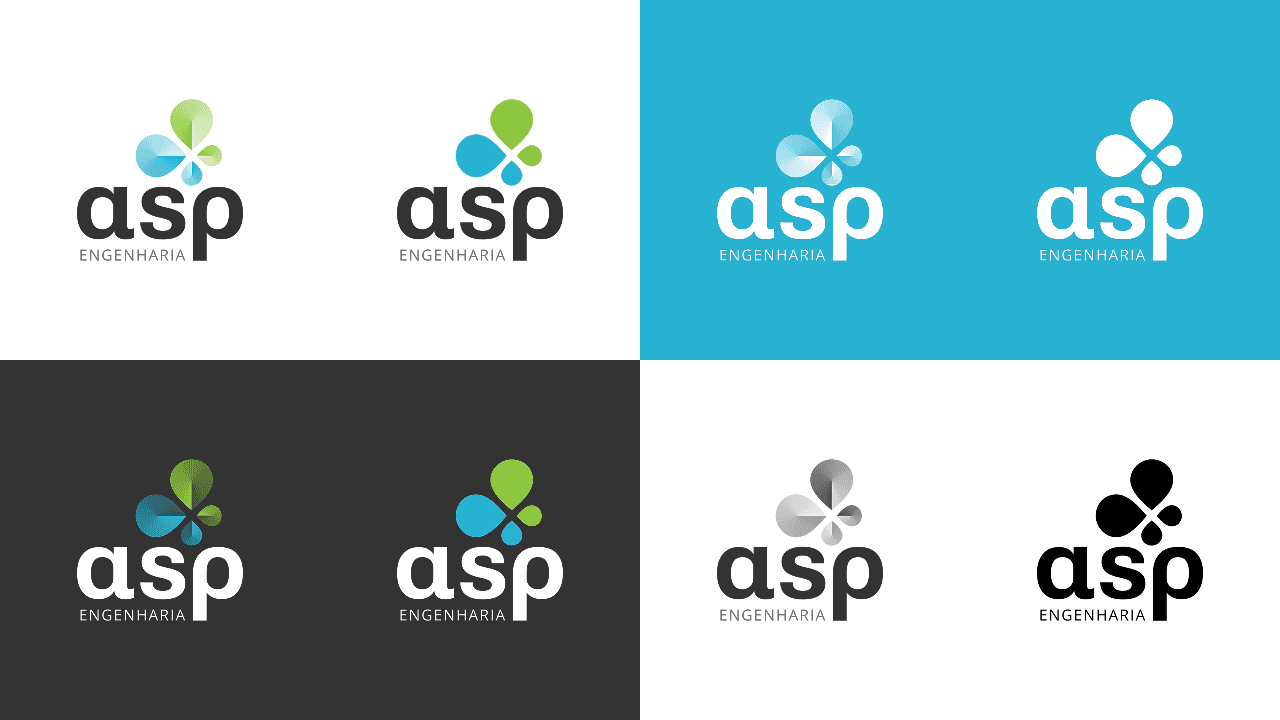
The new symbol synthesizes the company's expertise through nature-inspired forms. Its elements reference water, vegetation, and hydrology — an area now incorporated into the company's portfolio — while its composition also subtly suggests a butterfly figure, reinforcing the idea of transformation and balance between engineering and the environment.
The color palette preserves recognition built by the previous brand but was refined to strengthen this positioning. Green and blue now take center stage, highlighting the company's environmental focus and conferring greater visual unity to the identity.
The typography was also designed to communicate this universe. Its forms reference the Greek letters Alpha (α) and Rho (ρ), symbols frequently associated with exact sciences, bringing the identity closer to the engineering universe without resorting to obvious or literal solutions.
Finally, the three-dimensional treatment adds a perception of matter, volume, and depth — characteristics directly related to engineering practice. The gradient amplifies this sensation and strengthens the brand's presence in digital environments and high-quality prints. To ensure technical performance in processes such as screen printing, embroidery, and monochromatic engraving, a solid color version was also developed, preserving legibility and identity consistency across any application.