Sebrae "Entrepreneurial School" Branding
Development of the visual identity for the Entrepreneurial School project, a CER Sebrae initiative created to recognize educational institutions that promote entrepreneurship education through a national certification program.
Customer
Sebrae's Reference Center for Entrepreneurship
Categories
Branding; Visual Identity
Tools
Illustrator; Figma; Photoshop
Year
2022
The brand needed to represent more than an educational institution. It should communicate a journey of transformation, collaboration, and innovation, capable of connecting schools, educators, and knowledge in a single ecosystem.
Context
The Sebrae Reference Center for Entrepreneurship Education (CER Sebrae) conceived the Entrepreneurial School Journey, a national program created to encourage schools across the country to incorporate entrepreneurship education as an institutional development strategy.
At the time of the project, the initiative existed only as a concept. There was no visual identity to communicate its value proposition, nor a graphic system to unify the future digital platform, institutional materials, and certifications awarded to participating institutions.
The challenge was to transform an idea into a brand that conveyed innovation, belonging, and purpose from the first interaction.
The Vision
Before developing a visual identity, I prefer to understand how the project creators themselves envision what they're building.
During conversations with the CER Sebrae Innovation team, attributes emerged that served as a starting point for the creative process. The new brand should be perceived as:
Modern;
Gamified;
Aggregating;
Colorful;
Connected.
From this vision, I expanded the conceptual foundation by considering characteristics that directly spoke to educational leaders and the Journey's proposal, such as inclusion, community, co-creation, digital culture, and creativity.
These concepts guided all Design decisions throughout the visual identity development.

The Visual Identity
The visual identity was built to represent Entrepreneurial School as a constantly evolving community.
The symbol comprises independent geometric elements that, individually, can evoke students, books, school desks, or even programming blocks, establishing connections between education, technology, and innovation.
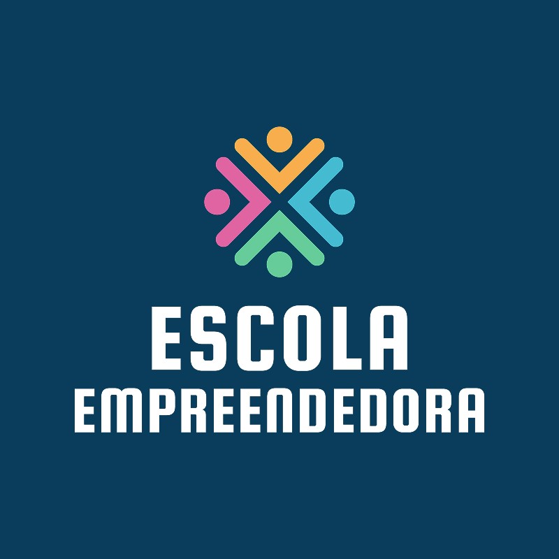
When brought together, these shapes create a circular composition representing collaboration, belonging, and collective knowledge building.
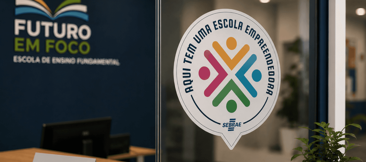
This choice also serves a functional need of the program. Since the Journey culminates in achieving the Entrepreneurial School Seal, the symbol was conceived to naturally adapt to circular formats, allowing the visual identity to be applied to certifications without losing recognition or consistency.
The color palette was developed from colors already used by CER Sebrae and the Entrepreneurial School Radar, strengthening the relationship between different initiatives and creating an integrated visual ecosystem.
The typography, composed of straight forms and uppercase letters, reinforces attributes such as modernity, clarity, and solidity, balancing the program's institutional character with its innovative proposal.
The visual identity guided all project applications, including the institutional Landing Page, the manager platform, the administrative area, and certification materials, ensuring visual unity across all Journey touchpoints.