Branding for "O Rei da Linguiça"
Brand design and visual identity development for a charcuterie and smoked meat business located at Mercado Central in Belo Horizonte (MG).
Customer
The Sausage King
Categories
Branding
Tools
Illustrator; Figma; Photoshop
Year
2024
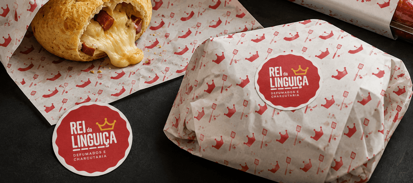
The brand needed to convey the quality of gourmet charcuterie while maintaining the proximity and authenticity that define the Central Market experience.
Context
O Rei da Linguiça is a specialized shop offering artisanal charcuterie, cured meats, and smoked products, located at Mercado Central in Belo Horizonte — one of the city's leading food and tourism destinations.
The Market brings together businesses across diverse segments, from small producers and traditional retailers to gourmet shops, bars, and specialty stores. This diversity is reflected in its audience, comprising both local residents and tourists seeking authentic Minas Gerais experiences.
In this context, the visual identity needed to stand out within a visually intense environment while communicating the artisanal quality of its products without losing connection with a broad and diverse audience.
The Vision
O projeto visou posicionar O Rei da Linguiça como referência em charcutaria artesanal, oferecendo produtos de alta qualidade em um ambiente acolhedor e descontraído.
Mais do que um ponto de venda, a loja foi concebida como um espaço de experiência gastronômica onde os clientes pudessem descobrir diferentes tipos de embutidos curados, defumados, molhos, temperos e produtos regionais, além de saborear pratos preparados na hora, como o tradicional pão de queijo recheado com linguiça artesanal e queijo Canastra.
Ao mesmo tempo, a identidade precisava funcionar no espaço digital. A estratégia incluiu investimento consistente em redes sociais e serviços de entrega, exigindo uma marca versátil que fosse facilmente reconhecível e capaz de manter sua personalidade em fachadas de lojas, embalagens e canais digitais.

The Visual Identity
The visual identity was developed to balance two attributes that might initially seem contradictory: sophistication and approachability.
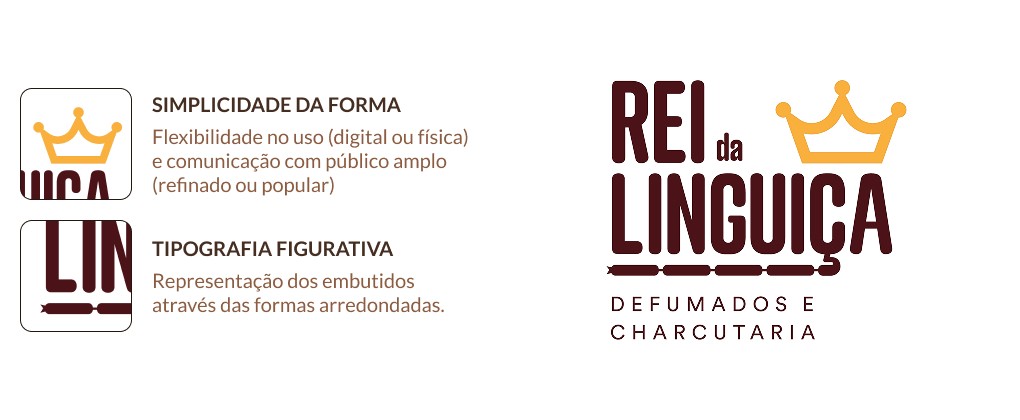
The crown symbol reinforces the brand's positioning as a quality reference, visually translating the concept embedded in the business name itself.

In contrast, the graphic construction adopts simple forms and flat language, allowing the brand to remain accessible, friendly, and easily recognized across different scales and applications. This approach also supports its use in digital environments, packaging, signage, and promotional materials.
The typography, featuring elongated characters and rounded corners, was chosen to subtly evoke the shape of artisanal cured meats, reinforcing the brand's personality without resorting to literal elements.
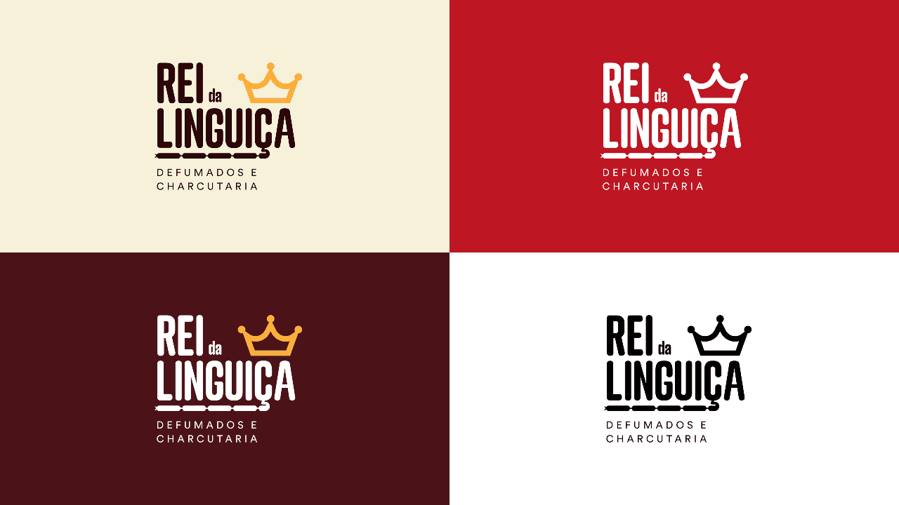
The color palette combines red, brown, and kraft paper-inspired tones, creating an identity that simultaneously references the rustic nature of artisanal production, smoking processes, and the gastronomic universe. Beyond strengthening the visual concept, red also increases brand visibility and stimulates appetite — a characteristic widely used in food industry communications.
To complement the identity system, I developed an exclusive mascot for delivery packaging and communications materials. The character expands brand recognition potential, adding personality depth and creating a more memorable experience both in the physical space and on social media.
The visual identity was applied across storefronts, packaging, food paper, labels, promotional materials, and digital channels, creating a cohesive system capable of supporting the brand's growth across multiple touchpoints.