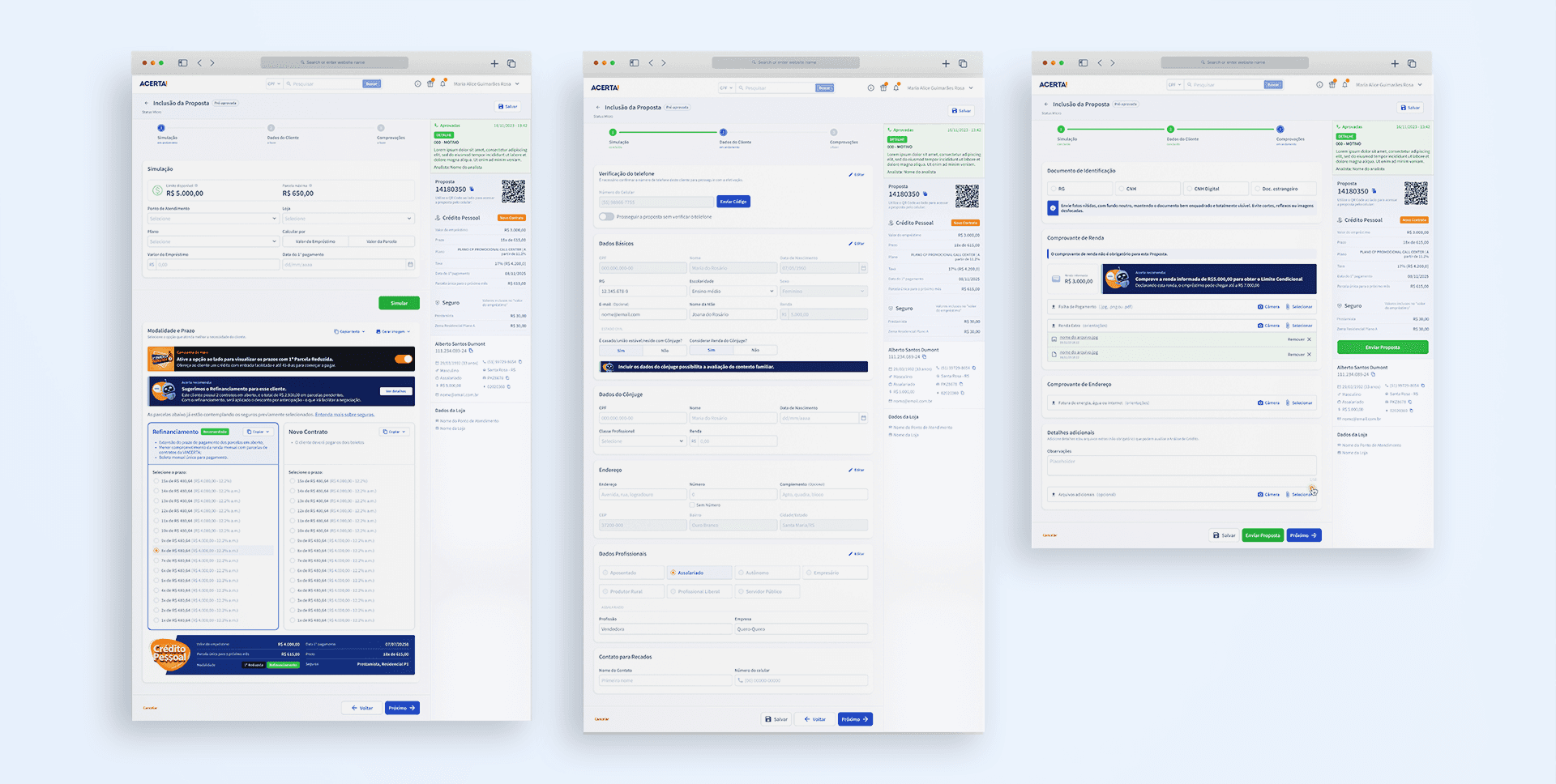
Design System for the Acerta Platform
Restructuring Acerta’s Design System to establish a consistent, scalable foundation and improve efficiency across Design and Engineering.
Customer
VIACERTA Financeira
Categories
Design System
Duration
20 days
My Role
Product Designer
Tools
Figma
Team
Product Designer; Frontend

The challenge went beyond UI inconsistencies. Without a scalable foundation, Design and Engineering were repeatedly solving problems that should have been standardized at the system level.
Context
Acerta is a financial services company specializing in microcredit for individuals, with nationwide operations and a network of branches primarily across Brazil’s South, Southeast, and Central-West regions.
Its portfolio includes credit products from multiple financial institutions, with a strong focus on products offered by Viacerta Financeira, which belongs to the same business group.
To support its operations, the company has an in-house Technology organization composed of Product, Design, and Engineering professionals responsible for building and evolving its digital platforms.
When I joined the team, my initial scope was focused on designing a solution for managing commercial campaigns. During my first few weeks, however, I identified a structural opportunity that extended beyond that project and affected the platform as a whole: the existing Design System lacked the consistency and scalability required to support the product’s continued growth.
The Challenges
The existing library included reusable components and styles, but its underlying architecture was not structured to scale effectively.
The color palette was limited and did not fully reflect the brand identity. Typography offered too few combinations of sizes and weights, and there was no clear distinction between foundational tokens and their semantic applications.
The component architecture also made reuse and evolution difficult, increasing the risk of new patterns being created in isolation as the platform continued to grow.
I presented this assessment to the leadership team and proposed rebuilding the Design System as a foundational product initiative, demonstrating how a stronger system could improve efficiency and consistency across both Design and Engineering.
The proposal was approved, but there was one major constraint: the Technology roadmap was already committed to other priorities.
I had 20 days to build the new Design System.
The challenge, therefore, was to create a foundation robust enough to support the platform’s evolution without unnecessarily redesigning everything that already existed.
The Approach
Given the limited timeframe, I established one guiding principle from the start: preserve what worked and rebuild only what compromised the system’s consistency or scalability.
Token Audit and Foundations
I started by auditing the existing design tokens.
Elements that already met the product’s needs, including some shadow and grid definitions, were preserved. Others needed to be reworked.
The color palette was expanded and brought closer to the brand identity, introducing a broader range of primary colors as well as a more comprehensive structure for system states.
The type scale was also redesigned to provide a wider range of sizes and weights, enabling clearer and more consistent information hierarchy across the interfaces.
These foundations were centralized in a dedicated primitive token library, establishing the core layer of the system.
Semantic Tokens
Building on those foundations, I created a second token layer focused on contextual usage across the interface.
Using Figma Variables, I structured semantic tokens for applications such as:
headings, body text, and captions;
backgrounds and surfaces;
fills and outlines;
system states and feedback.
Rather than defining the entire structure in isolation before building the components, I took an iterative approach: tokens were applied, tested, and refined as new components surfaced additional product needs.
Component Architecture
Once the foundations were established, I began rebuilding the component library following Atomic Design principles. Basic elements such as icons, images, inputs, and cells were treated as reusable building blocks that could be progressively combined into more complex components.
This architecture was particularly valuable for structures such as dialogs, containers, and tables.
For dialogs, for example, headers, content areas, and footers were structured as independent building blocks, with variants designed to accommodate different use cases.
For tables, individual cells were componentized to support different types of content, including text, icons, buttons, and inputs. These cells could then be combined into reusable rows, which in turn supported multiple table configurations.
The goal was not simply to create a library of ready-made components, but to establish a flexible architecture where new requirements could be addressed through composition, reducing the need to continuously create isolated components.
The Solution
The new Design System was designed to function not only as a component library, but also as a shared foundation for the teams responsible for evolving the platform.
To improve discoverability and adoption, I organized the components into categories based on common Design System patterns:
Page Structure · Navigation · Data Display · Forms · Feedback · Entities · Custom Components
Two of these categories were created specifically around Acerta’s product needs.
Entities brings together components associated with core business objects, such as Customers, Contracts, Collateral, Branches, Products, and Proposals.
Custom Components contains patterns specific to the Acerta experience, including charts, marketing communications, custom alerts, and app-related CTAs.
I also created an overview page that serves as a visual index of the library, allowing designers and developers to quickly identify existing components before introducing new solutions.


Results and Learnings
By the end of the project, the Design System included 75 components, supported by the primitive and semantic token architecture required to ensure consistent usage.
Implementation was carried out in close collaboration with the Engineering team. We established weekly sessions to clarify component behaviors, discuss implementation decisions, and incorporate developers’ feedback into the ongoing refinement of the system.
Today, the Design System is part of the day-to-day workflow of both Design and Front-end teams, providing a shared foundation for building Acerta’s interfaces. In addition to accelerating the design and implementation of new features, the new structure has improved visual consistency across the platform and established a more scalable foundation for its continued evolution.
"I had the opportunity to lead the team where Ana Emília worked as a Product Designer. She joined the company at a time when Design was still in its early stages and was instrumental in establishing a strong foundation for the discipline. Her contributions ranged from implementing DesignOps practices and creating a consistent user experience across our sales platform to launching new products that delivered real value to our customers.
Ana's technical expertise is outstanding, and she has a remarkable ability to elevate the quality, maturity, and impact of every team she works with."

Nícolas Tischler
Product Manager