O Rei da Linguiça Branding
Brand design and visual identity development for a charcuterie and smokehouse business located in the Central Market of Belo Horizonte (MG).
Customer
The Sausage King
Categories
Branding
Tools
Illustrator; Figma; Photoshop
Year
2024
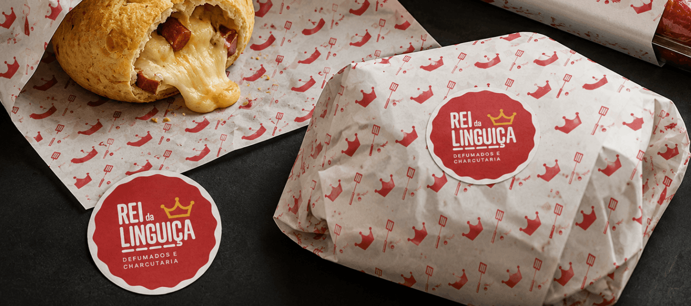
The brand needed to convey the quality of a gourmet charcuterie without losing the closeness and authenticity that are part of the Central Market experience.
Context
O Rei da Linguiça is a shop specialized in artisanal charcuterie, sausages, and smoked meats, located in the Central Market of Belo Horizonte — one of the main tourist and gastronomic spots in the city.
The Market brings together businesses from a wide range of segments, from small producers and traditional shops to gourmet stores, bars, and specialized emporiums. This diversity is also reflected in its audience, composed of both city residents and tourists seeking typical experiences of Minas Gerais culture.
In this context, the visual identity needed to make the brand stand out in a visually intense environment, while transmitting the artisanal quality of its products without losing its proximity to a broad and diverse audience.
The Vision
The objective of the project was to position O Rei da Linguiça as a reference in artisanal charcuterie, offering high-quality products in a welcoming and relaxed environment.
More than just a point of sale, the store was conceived as a gastronomic experience space where customers could discover different types of cured meats, smoked products, sauces, spices, and regional products, as well as enjoy dishes prepared in the store itself, such as the traditional cheese bread stuffed with artisanal sausage and Canastra cheese.
At the same time, the identity also needed to work in the digital environment. The strategy called for a consistent investment in social media and delivery services, requiring a versatile, easily recognizable brand capable of maintaining its personality on storefronts as well as in packaging and digital channels.

The Visual Identity
The visual identity was developed to balance two attributes that, at first glance, might seem opposite: sophistication and proximity.
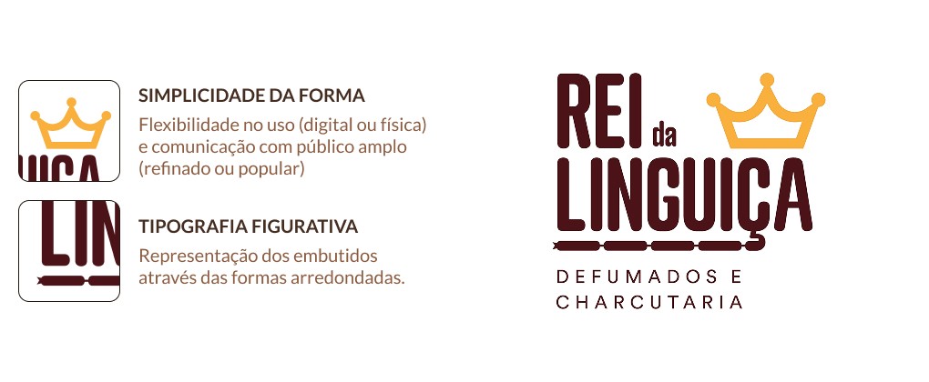
The crown symbol reinforces the brand's positioning as a benchmark in quality, visually translating the concept present in the business's own name.

In contrast, the graphic construction adopts simple shapes and flat language, allowing the brand to remain accessible, friendly, and easily recognized across different scales and applications. This choice also favors its use in digital environments, packaging, signage, and promotional materials.
The typography, with elongated characters and rounded corners, was chosen to establish a subtle association with the shape of artisanal charcuterie, reinforcing the brand's personality without resorting to literal elements.
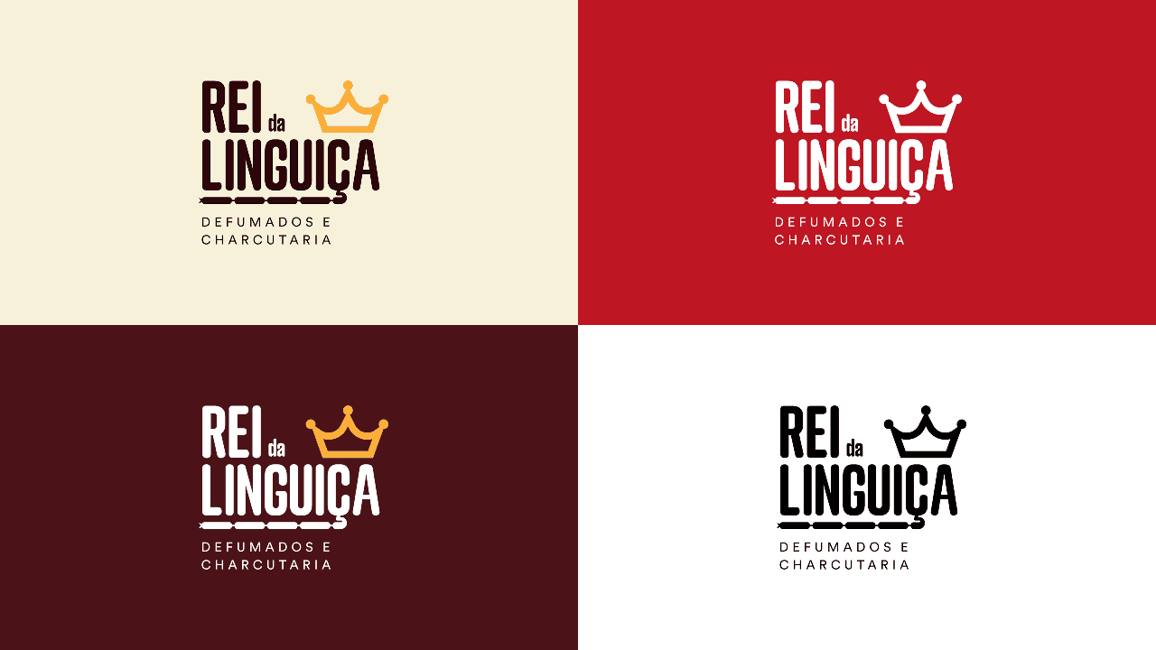
The color palette combines red, brown, and tones inspired by kraft paper, creating an identity that simultaneously evokes the rusticity of artisanal production, smoking processes, and the gastronomic universe. In addition to strengthening the visual concept, red also contributes to increasing brand visibility and stimulating appetite, a characteristic widely explored in communication within the food sector.
As a complement to the identity system, I developed an exclusive mascot to decorate delivery packaging and communication materials. The character enhances the brand's recognition potential, adding a layer of personality and making the experience more memorable both in the physical environment and on social media.
The visual identity was applied to storefronts, packaging, food wrapping paper, labels, promotional materials, and digital channels, creating a consistent system capable of supporting the brand's growth across various touchpoints.