Ideas for Milk Event Identity
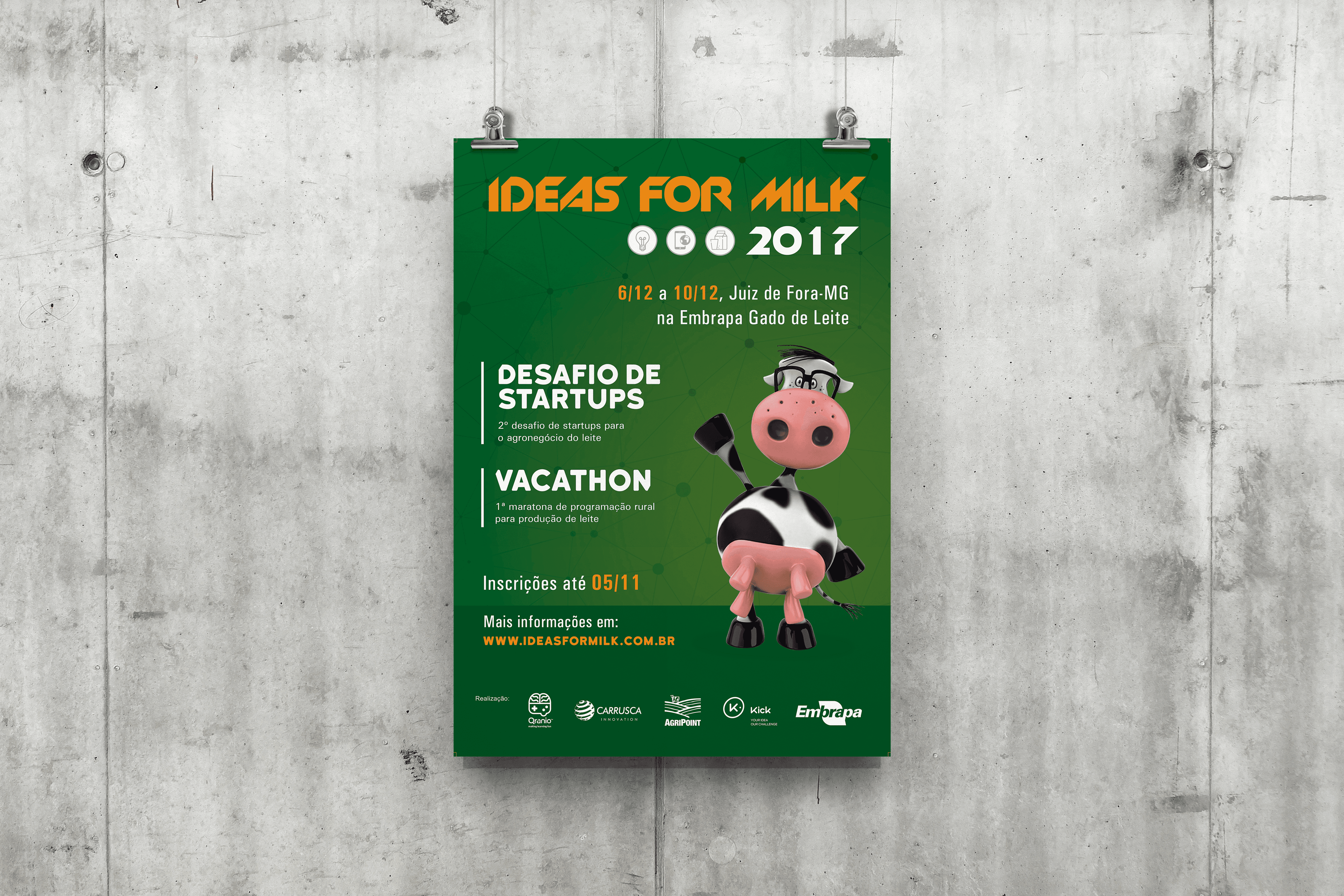
Visual identity system developed for the second edition of Ideas for Milk and for the event's first rural programming marathon.
Customer
Embrapa Dairy Cattle
Categories
Visual Identity
Tools
Illustrator; Photoshop; InDesign
Year
2017

The challenge was to create an identity capable of connecting tradition, technology, and entrepreneurship in a single event.
Context
Ideas for Milk is an initiative of Embrapa Gado de Leite created to bring researchers, startups, universities, and companies closer together around innovation for the milk production chain.
In its second edition, the event had already consolidated itself as the main Brazilian initiative aimed at developing new technologies for the sector, bringing together startup challenges, programming marathons, and research projects in the same collaboration environment.
During my internship at the Organizational Communication Center of Embrapa Gado de Leite, I was responsible for developing the visual identity of the 2017 edition and creating the graphic materials that gave unity to the event's communication.
State of the Art
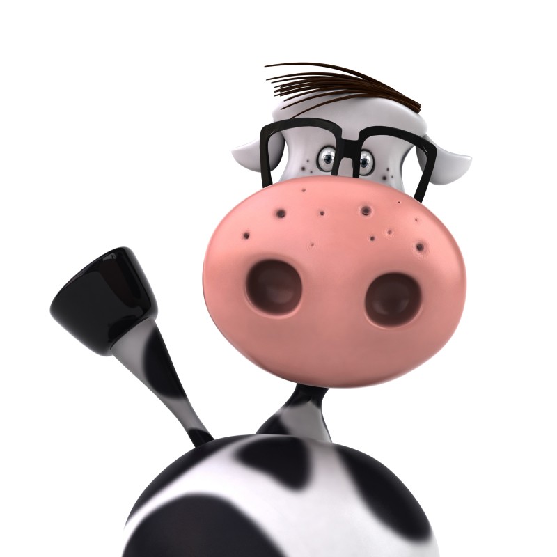
Since this was the second edition of Ideas for Milk, some elements of the identity were already established. The visual signatures of the event, the Startup Challenge, and the Vacathon had been defined the previous year, as well as the mascot — a friendly little cow that became one of the main symbols of the initiative.
My challenge was not to redesign the brand, but to expand this language to create a consistent visual identity, capable of connecting all communication fronts of the event.

The Visual Identity
The visual identity was built from the concept of connectivity, using a graphic language inspired by networks, connections, and technology to represent the collaboration between research, innovation, and agribusiness.
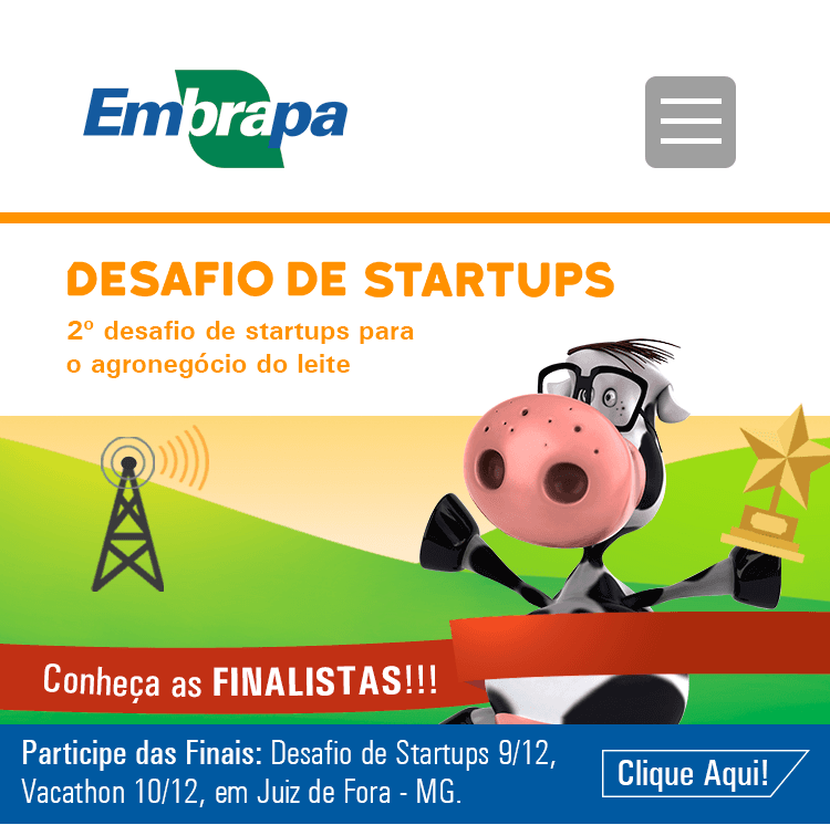
The mascot gained prominence throughout the communication, becoming an element of connection with the audience and reinforcing the event's personality.
More than creating isolated pieces, the objective was to develop a visual system capable of functioning consistently across different media, maintaining recognition and unity throughout the participant's experience.
The promotion of the event started long before registrations opened. To this end, I developed pieces for Facebook and Instagram and collaborated with the IT team in adapting the website interface to the visual identity of the edition.
This project marked my first contact with interface design — an experience that, years later, would become the starting point of my journey in UX and Product Design.
However, the visual identity needed to work far beyond the digital environment.
I developed a complete communication system for the in-person event, including banners, large-format building wraps, signage, flyers, t-shirts for different audiences, animations for the main screen, and even the trophy awarded to the winners.
More than just producing graphic materials, the goal was to ensure a consistent visual experience at all touchpoints between the attendees and the event.